

TL;DR
Your app store listing is the single page that determines whether someone downloads your app or keeps scrolling. With over 1.8 million apps on the App Store and most getting fewer than 100 downloads in their first month, every element matters. This guide covers all 14 components of a high-converting listing, from app name to localization, with exact specs, conversion data, and the mistakes that get apps rejected. Average iOS listing conversion sits around 25%, but optimizing each element can push that number significantly higher.
An App Store listing is made up of 14 core metadata and visual elements that determine how your app ranks in search and converts visitors into downloads. The most important ranking elements on iOS are the App Name, Subtitle, and Keywords field, while the biggest conversion drivers are your App Icon, Screenshots, Ratings, and App Preview Video. Optimizing every element together—not individually—produces the highest App Store conversion rates and better App Store Optimization (ASO) results.
App Store Listing Components at a Glance
Component | Helps Rankings | Helps Conversion | Required |
|---|---|---|---|
App Name | ✅ High | ✅ High | Yes |
Subtitle | ✅ High | ✅ Medium | Yes |
Keywords | ✅ High | ❌ | iOS Only |
Description | Google Play Only | ✅ Medium | Yes |
App Icon | ❌ | ✅ High | Yes |
Screenshots | ❌ | ✅ Very High | Yes |
Preview Video | ❌ | ✅ High | Optional |
Ratings & Reviews | ✅ Moderate | ✅ High | Automatic |
Privacy Details | ❌ | Trust & Compliance | Yes |
Localization | ✅ | ✅ | Optional |
Why Your App Store Listing Is the Only Page That Matters
Roughly 70% of app installs originate from app store search. That means for most apps, especially indie ones without ad budgets, the store listing is the entire marketing funnel. It’s the billboard, the landing page, and the checkout counter rolled into one.
Here’s the uncomfortable math: AppTweak’s H1 2024 data shows iOS store pages convert about 25% of visitors, while Google Play averages 27.3%. That means three out of four people who see your listing leave without downloading. Most users decide within 3 seconds whether to install or move on.
The good news? Most of your competition is doing this badly. Practitioners on indie developer forums consistently report that a focused, research-driven approach to their listing moved them from invisible to top 10 for valuable keywords within weeks. The bar is low. Clearing it requires understanding what each element does and how to make it work.
If you’re building an app from scratch and want one place to handle everything from planning through App Store submission, see how x1 works end to end.
This guide walks through every element of a complete app store listing, the specs Apple and Google require, the conversion impact of each piece, and the common mistakes that lead to rejection.
At-a-Glance: Every App Store Listing Element
Element | Character/Size Limit | Indexed for iOS Search? | Conversion Impact | Update Frequency |
|---|---|---|---|---|
App Name | 30 characters | Yes (strongest factor) | High | Rarely (brand risk) |
Subtitle | 30 characters | Yes | High | Each version |
App Icon | 1024×1024 PNG | No | Up to +22.8% lift | Test quarterly |
Screenshots | 1–10 images, specific sizes | No | +21.7% uplift | 2–4× per year |
App Preview Video | Up to 30 sec, up to 3 videos | No | +20% to +47% lift | As features change |
Description | 4,000 characters | No (iOS) / Yes (Google Play) | Low (1% read fully) | Each version |
Keywords Field | 100 characters | Yes | Critical | Each version |
Promotional Text | 170 characters | No | Low (timely messaging) | Anytime |
Category | Primary + Secondary | No | Moderate (Top Charts) | Rarely |
In-App Purchases | 20 items, 35-char names | Appear in search results | Moderate | As pricing changes |
Ratings & Reviews | N/A | Influences ranking | High | Ongoing |
Privacy & Age Rating | Required fields | No | Rejection risk if missing | Each version |
Localization | Per-market versions | Per-language fields | Up to +8.6% lift | Each version |
What’s New | No hard limit | No | Low (retention-focused) | Each version |
How an App Store Listing Works
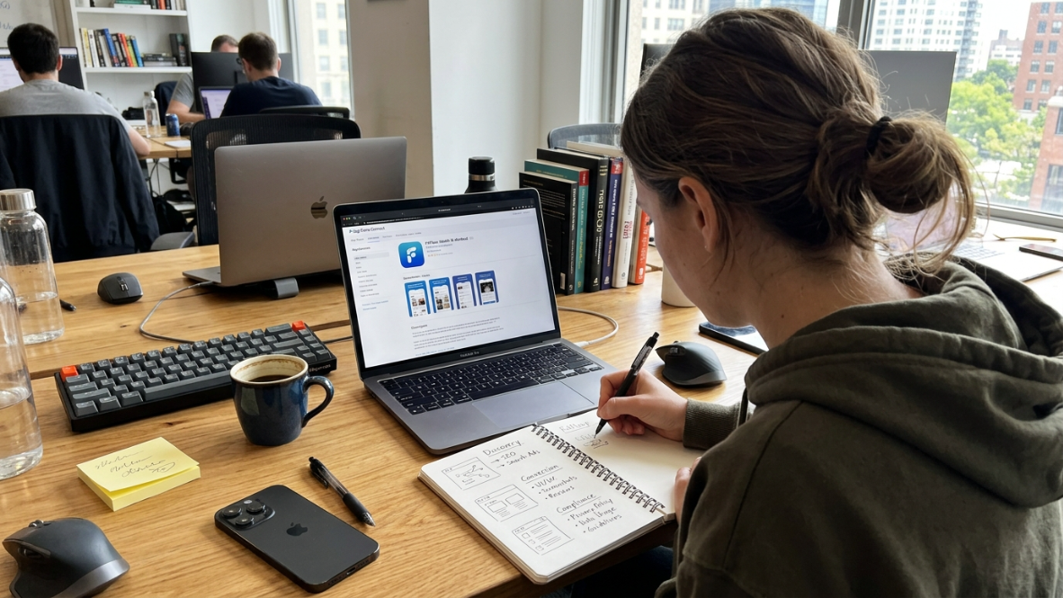
Most developers think of an App Store listing as a page that describes an app. In reality, it serves three different purposes simultaneously.
Discovery
Apple indexes selected metadata fields to determine which apps appear for a search query.
Conversion
Visual assets such as the icon, screenshots, preview video, ratings, and pricing persuade users to install.
Compliance
Metadata must comply with Apple's App Review Guidelines. Incorrect privacy information, misleading screenshots, trademark violations, or inaccurate descriptions can delay approval or result in rejection.
Thinking of your listing as three systems working together—search visibility, conversion, and compliance—helps prioritize improvements.
1. App Name
Best for: Discoverability. Your app name is the single most important ranking factor in the App Store.
Specs:
Maximum 30 characters
Must be unique and not infringe on trademarks
Displayed in search results, charts, and your product page
Best practices:
Include your most important keyword naturally. If your app is a meditation timer, “Calm Timer” beats “SereniFlow.”
Keep it simple and easy to spell. Users who can’t remember your name can’t search for it.
Don’t stuff it with keywords. Apple explicitly warns against packing metadata with generic terms or competitor names, and doing so is a common reason for rejection.
Tradeoffs:
You only get 30 characters, so there’s genuine tension between brand identity and keyword inclusion.
Changing your app name after launch resets brand recognition. Get it right early.
What goes wrong: Apple’s guidelines state that app names should not include pricing information, irrelevant phrases, or terms designed to game the system. One of the fastest paths to rejection is cramming your title with keywords that don’t accurately describe what the app does.
2. Subtitle
Best for: Expanding on your name with a keyword-rich value proposition.
Specs:
Maximum 30 characters
Appears below your app name throughout the App Store
Indexed for search on iOS
Best practices:
Complement, don’t repeat, the app name. If your name contains “Budget,” your subtitle shouldn’t also say “Budget.” Use those 30 characters for different searchable terms.
Explain the value. “Track Spending in Seconds” tells users what they get. “World’s Best Finance App” tells them nothing (and violates Apple’s guidelines against generic superlatives).
Treat this as your second-most-valuable keyword slot after the title.
Tradeoffs:
Only 30 characters forces hard prioritization. You can’t fit everything.
Updated only with new app versions, so you can’t A/B test quickly.
On iOS, Apple’s algorithm focuses on a limited set of text fields. Your app name, subtitle, and the hidden keyword field are the only places where keywords directly influence search rankings. The long description does not get indexed. This makes every character in your subtitle count.
3. App Icon
Best for: First impressions. The icon is the very first visual element users see in search results.
Specs:
1024×1024 pixels, PNG format, no transparency
Apple automatically resizes for different contexts (home screen, search results, settings)
Best practices:
Keep it simple with one focal element. The best icons read clearly at 60×60 pixels on a phone screen.
Make it distinctive enough to stand out in a grid of competitors.
Convey your app’s core function visually without relying on text.
Conversion impact: SplitMetrics found icon changes can improve conversion by up to 30%. AppTweak’s 2025 benchmarks show a +22.8% uplift on the App Store from icon optimization alone. That’s a massive return for what seems like a small design decision.
Tradeoffs:
Icon A/B testing on iOS requires Apple’s Product Page Optimization feature, which has limited traffic allocation.
Radical icon changes can confuse existing users who search for the familiar image.
Testing tip: Change the symbol or focal subject, not just colors. Color shifts rarely produce statistically significant results, but switching from an abstract shape to a recognizable object often does.
4. Screenshots
Best for: Conversion. Screenshots are the highest-impact visual element on your listing.
Specs:
1 to 10 screenshots per device size
Required sizes for iPhone: 6.9-inch displays (1290×2796 or 1320×2868 pixels) and 6.5-inch displays (1284×2778 or 1242×2688 pixels)
Displayed in search results and on your product page
Best practices:
Lead with benefits, not features. “See your savings grow weekly” beats “Dashboard with chart view.” The biggest mistake is screenshots that show what the app does instead of what the user’s life looks like after using it.
Front-load your strongest two images. Only 17% of visitors scroll past the first screenshot. The first two do most of the heavy lifting.
Use text overlays sparingly and make them readable at thumbnail size.
Update screenshots 2–4 times per year. Top-performing apps treat screenshots as living marketing assets, not set-and-forget uploads.
Conversion impact: Screenshots show a +21.7% uplift potential on the App Store and +24.3% on Google Play. Sensor Tower found that simply reordering screenshots (same images, different sequence) drove 6.4% more installs in a 30-day test. The order matters as much as the content.
The DIY vs. tool debate: Practitioners on Reddit report that many indie iOS developers still prefer making screenshots manually in Figma using iPhone device templates because the results feel more polished. AI screenshot generators save significant time, but the templates can feel generic. The right choice depends on how much design control matters to you versus how much time you can spend.
If you’re using an end-to-end AI app studio that generates native iOS apps, the screenshots reflect real native UI rather than mockups, which matters for both conversion and Apple’s requirement that screenshots show actual app interface.
What Makes a High-Converting Screenshot?
The highest-converting screenshots usually follow a consistent structure.
State the user's biggest benefit.
Show the feature that delivers it.
Keep overlay text under 8 words.
Use one message per screen.
Maintain consistent branding across all images.
Avoid clutter, tiny text, and feature lists that are difficult to read on mobile devices.
5. App Preview Video
Best for: Demonstrating complex features or workflows that screenshots can’t convey.
Specs:
Up to 30 seconds per video
Up to 3 app preview videos
Must show actual app functionality (no external footage or misleading content)
Best practices:
Lead with the most compelling moment in the first 5 seconds. Don’t waste time on logos or intros.
Design for muted viewing. Most users won’t tap for sound. Use text overlays and visual storytelling.
Show the app solving a real problem, not a feature tour.
Conversion impact: StoreMaven data suggests preview videos produce roughly a +20% lift in conversion. On iOS, where videos autoplay in search results, the impact jumps to +47%. On Google Play, only about 6% of visitors actually tap to play a video, so the ROI is much lower there.
Tradeoffs:
Production quality matters. A bad video hurts more than no video at all.
Videos must show actual app UI, which means you need a working build before you can create them.
File size and encoding requirements are strict. Apple rejects videos that don’t meet spec.
6. Description
Best for: Providing context for users who want more detail before downloading.
Specs:
Up to 4,000 characters
Updated only with new app versions (unlike promotional text)
Best practices:
Front-load everything important into the first sentence. That’s what users see without tapping “more,” and only about 1% of people read the full description.
Write for humans, not algorithms. On iOS, the long description is not indexed for keyword search. Your keywords field handles that.
Structure with short paragraphs and bullet points for scannability.
Focus on outcomes. A common mistake is treating app listings like feature sheets. Users care about how the app improves their lives.
iOS vs. Google Play difference: This is critical. On Google Play, the long description IS indexed for keywords, so natural keyword placement matters there. On iOS, stuffing keywords into your description accomplishes nothing for search ranking. Write your iOS description purely for conversion.
If you’re a first-time builder trying to turn an app idea into a real app, the description is where you tell the human story of why this app exists. Lead with the problem, show the solution, and keep it short.
Recommended Description Structure
A strong App Store description usually follows this framework:
One-sentence value proposition
Three to five key benefits
Core features
Social proof or credibility
Call to action
Most users only read the first few lines, so place the most persuasive information first.
7. Keywords Field (iOS Only)
Best for: Search ranking on the App Store. This hidden field is surgically important.
Specs:
Exactly 100 characters total
Comma-separated, no spaces between terms
Not visible to users
Best practices:
Use all 100 characters. Every unused character is wasted ranking potential.
Separate keywords with commas only (no spaces). The system interprets them automatically.
Don’t duplicate words that already appear in your app name or subtitle. Apple already indexes those.
Avoid trademarked terms and competitor names. Improper keyword use is a common reason for App Store rejections.
Update keywords with each app version based on performance data.
Practical keyword research: The simplest and most underrated keyword research tool is the App Store search bar itself. Start typing a word related to your app and observe the autocomplete suggestions. These are real terms that real users are actively searching for.
Tradeoffs:
100 characters is extremely limited. You’ll agonize over every word.
No built-in analytics from Apple on keyword performance. Third-party tools (AppTweak, Appfigures, ASOdesk) fill this gap but add cost.
Testing keywords requires submitting new versions, which means slower iteration cycles.
8. Promotional Text
Best for: Timely messaging that doesn’t require a new app submission.
Specs:
Up to 170 characters
Appears above the description on your product page
Can be updated anytime without submitting a new version
Best practices:
Use this for seasonal promotions, new feature announcements, or event tie-ins.
Don’t waste it on keywords. Apple explicitly states promotional text doesn’t affect search ranking.
Refresh it regularly to signal active development to browsing users.
Tradeoffs:
No search ranking benefit means this is purely a conversion play.
170 characters limits what you can say. Treat it like a tweet, not a paragraph.
Many developers forget this exists and leave it blank, which is a missed opportunity.
9. Category Selection
Best for: Appearing in the right Top Charts and browse tabs.
Specs:
One required primary category
One optional secondary category
Determines which tab and charts your app appears in
Best practices:
Choose the category that most accurately describes your app’s primary function. Apple may reject your app if the category is misleading.
Consider competition density. A less competitive secondary category can give you more visibility in Top Charts even if your primary category is crowded.
Tradeoffs:
Wrong category selection can result in rejection during App Review.
Changing categories later may reset your chart position.
Some apps genuinely fit multiple categories, forcing a compromise.
10. In-App Purchases & Subscriptions on Listing
Best for: Transparency and discoverability of your monetization model.
Specs:
Up to 20 items displayed across in-app purchases and subscriptions
You choose the display order
Names: 35 characters max
Descriptions: 55 characters max
Best practices:
Lead with your most popular or highest-value offering.
Write descriptions that emphasize what the user gets, not what it costs.
Ensure exact price matching between your listing metadata and in-app pricing. A mismatch, even one dollar, can trigger rejection and delay your launch by a week or more.
In-app purchase items can appear in App Store search results and featured sections, making them an underappreciated discovery channel. Practitioners report that well-named IAP items sometimes rank for keywords the main listing doesn’t target.
For guidance on navigating the full app launch and review process, including pricing and subscription compliance, that linked guide covers common pitfalls.
11. Ratings & Reviews

Best for: Social proof and ranking signals. High ratings both improve search position and reassure visitors.
Specs:
Star rating (1–5) based on user reviews
You can prompt for ratings using SKStoreReviewController up to 3 times in a 365-day period
Developer responses are visible on the product page
Best practices:
Use the rating prompt strategically. Trigger it after a positive moment (completing a task, reaching a milestone) rather than on first launch.
Respond to every negative review within 48 hours. This shows potential users you’re actively maintaining the app, and sometimes the reviewer updates their rating.
Never incentivize reviews. Apple prohibits it and will reject or remove your app.
Tradeoffs:
You only get 3 prompts per year per user. Timing matters enormously.
Early negative reviews can tank conversion before you have enough volume to recover the average.
Resetting ratings on a major version update is sometimes worth it, sometimes not. It depends on whether your new version genuinely fixes the complaints.
12. Privacy Information & Age Rating
Best for: Compliance. Getting these wrong is the fastest path to binary rejection.
Specs:
Privacy policy URL required for all apps
Age rating determined through Apple’s questionnaire (Apple assigns the final rating)
Privacy nutrition labels must accurately reflect data collection practices
Privacy manifests required for certain APIs and third-party SDKs
Best practices:
Complete the privacy questionnaire honestly. Misrepresenting data collection practices leads to removal, not just rejection.
Keep your privacy policy URL active and updated. A dead link triggers rejection.
Account for all third-party SDKs in your privacy manifest. Missing manifests have been one of the most common binary rejection causes from 2024 through 2026.
Context: In 2026, Apple reviewed around 7.77 million app submissions and rejected nearly 25%, approximately 1.93 million, for failing to meet quality, safety, or design requirements. Privacy and metadata issues account for a significant share of those rejections.
13. Localization
Best for: Reaching non-English markets without additional development work.
Specs:
Localize app name, subtitle, keywords, description, screenshots, and promotional text per market
Custom Product Pages allow tailored listings for different audiences and campaigns
Best practices:
Even basic translation outperforms showing English to non-English users. You don’t need perfect localization to see gains.
Localize your keywords field separately for each language. Direct translations often miss the actual search terms people use in that market.
Localize screenshots. Users in Japan expect different visual communication norms than users in Brazil.
The underutilized opportunity: Custom Product Pages remain surprisingly rare. Only 31% of apps and 26% of games use them, yet those who do see conversion lifts up to +8.6%. These pages let you create different listing variations for different ad campaigns or audience segments.
Tradeoffs:
Localization multiplies your maintenance burden. Every listing update needs to happen across all supported languages.
Poor translations can actually hurt worse than English-only listings.
Custom Product Pages require enough traffic volume to produce statistically meaningful test results.
14. What’s New (Version Notes)
Best for: Retention and re-engagement with existing users.
Specs:
No hard character limit (though Apple recommends keeping it concise)
Displayed on your product page under “What’s New”
Updated with each new version submission
Best practices:
List new features in order of importance. Lead with what users actually asked for.
For minor bug-fix releases, simple language like “Bug fixes and performance improvements” is fine.
Include a brief call-to-action when appropriate: “Try the new dark mode in Settings.”
Tradeoffs:
Version notes have minimal impact on new user conversion. They matter more for existing users deciding whether to update.
Overpromising in release notes and underdelivering erodes trust and invites negative reviews.
Which App Store Listing Elements Affect Rankings?
Not every field influences App Store search rankings.
Many developers spend hours optimizing descriptions that Apple doesn't even index.
Ranking Factors
Element | Indexed by Apple Search |
|---|---|
App Name | Yes |
Subtitle | Yes |
Keywords Field | Yes |
In-App Purchase Names | Sometimes |
Ratings & Reviews | Indirectly |
Description | No |
Promotional Text | No |
Screenshots | No |
Videos | No |
Knowing which fields actually affect rankings helps prioritize optimization efforts.
Recommended Order for Optimizing an App Store Listing
If you're launching a new app, optimize your listing in this order.
App Name
Subtitle
Keywords
Icon
Screenshots
Ratings
Preview Video
Description
Localization
Promotional Text
This order prioritizes elements with the largest impact on visibility and conversion.
Apple App Store vs Google Play Listing Differences
Although both stores share many listing elements, several important differences affect optimization.
Feature | Apple App Store | Google Play |
|---|---|---|
Description indexed | No | Yes |
Hidden keywords | Yes | No |
Subtitle | Yes | Short Description |
Promotional Text | Yes | No |
Custom Product Pages | Yes | Custom Store Listings |
Product Page Optimization | Yes | Store Listing Experiments |
Understanding these differences helps developers avoid applying Google Play ASO tactics to the App Store.
Common Listing Mistakes That Get You Rejected
Apple’s review team catches more listing problems than most developers expect. Here are the metadata-related rejection reasons that come up repeatedly:
Keyword stuffing. Cramming unrelated terms, competitor names, or trending phrases into your app name, subtitle, or keywords field. Apple’s guidelines are explicit: keep the 30-character app name relevant and use the 100-character keywords field for legitimate variations only.
Screenshots that don’t match actual UI. Your screenshots must show the real app interface. Mockups, aspirational designs, or screenshots from a different version will be flagged.
Price mismatches. If your listing metadata says $4.99 but your in-app price shows $5.99, Apple will reject you. A one-dollar mismatch can cost you a week. This is one of those surprise rejection reasons that trips up even experienced developers.
Missing demo credentials. If your app requires login, you must provide working test credentials for the review team. Forgetting this is embarrassingly common and entirely preventable.
Promising features not yet built. Your description and screenshots must reflect the current, shipping version. Describing upcoming features as if they already exist violates Apple’s guidelines.
Misleading categories. Selecting a category your app doesn’t belong in, hoping for less competition, risks outright rejection.
For non-technical founders navigating this process for the first time, the rejection rate can feel intimidating. But most rejections are preventable with careful attention to metadata accuracy.
Metrics to Track After Publishing
Publishing your listing is only the beginning.
Monitor these key performance indicators regularly.
Metric | Why It Matters |
|---|---|
Impressions | Search visibility |
Product Page Views | Listing traffic |
Conversion Rate | Download efficiency |
Downloads | Overall growth |
Keyword Rankings | Discoverability |
Retention | Listing quality |
Average Rating | Social proof |
Crash Rate | User experience |
Review these metrics after every significant listing update to determine whether changes improved performance.
How to Build and Launch Your Listing Without Tool Sprawl
Creating a complete app store listing involves writing copy, designing an icon, creating screenshots, selecting keywords, setting up privacy labels, and submitting for review. Most developers cobble together five or six different tools for this, and each handoff introduces friction and errors.
The pattern that works for indie developers and small teams: pick tools that handle multiple listing elements in one workflow. Keyword research tools like AppTweak or Appfigures cover the analytics side. Screenshot generators like AppLaunchpad or Rotato handle visuals.
But the bigger problem is that most AI app builders stop at code generation. They hand you a project file and wish you luck with everything that comes after: screenshots, metadata, submission.
x1 takes a different approach. Its Launch studio creates App Store screenshots, writes the listing copy, and handles submission in the same environment where you built the app. Because x1 generates native Swift and Xcode apps, the screenshots reflect real native UI, not web wrapper approximations. This matters both for conversion (users can tell) and for Apple’s requirement that screenshots show actual app interface.
Explore x1’s pricing plans to see which tier fits your launch timeline.
If you’re comparing different AI app builder approaches, the key question is whether the tool covers the last mile: listing assets, ASO metadata, and the submission workflow itself. Most don’t.
App Store Listing Optimization Checklist
Use this checklist before submitting every version.
App name contains primary keyword naturally
Subtitle communicates value
Keywords field uses all available characters
Screenshots show actual app UI
First screenshot explains the primary benefit
Preview video demonstrates real functionality
Description starts with the value proposition
Privacy labels are accurate
Category is correct
Prices match in-app purchases
Test credentials included
Localization reviewed
Promotional text updated
Version notes completed
Frequently Asked Questions
How many screenshots do I need for my App Store listing?
Apple requires between 1 and 10 screenshots for iPhone apps. While the minimum is 1, you should use at least 5 or 6 to tell a complete story. The first two screenshots matter most since only 17% of visitors scroll beyond the first one.
Does the app description affect search rankings on iOS?
No. On iOS, the long description is not indexed for keyword search. Only your app name, subtitle, and the hidden keywords field influence search rankings. On Google Play, the description IS indexed, so keyword placement matters there. Write your iOS description purely for conversion, not search optimization.
How often should I update my app store listing?
Top-performing apps update their screenshots 2–4 times per year and refresh keywords with each version release. Promotional text can be updated anytime without a new submission, making it ideal for seasonal or timely messaging.
What causes App Store listing rejections?
The most common listing-related rejection causes include keyword stuffing, screenshots that don’t match actual app UI, price mismatches between metadata and in-app pricing, misleading category selection, and missing privacy information. Apple rejected nearly 25% of the roughly 7.77 million submissions it reviewed in 2026.
What’s the difference between promotional text and the description?
Promotional text (170 characters) can be updated anytime without submitting a new app version and appears above the description. It’s not indexed for search. The description (4,000 characters) can only be changed with a new version submission and, on iOS, is also not indexed for search. Use promotional text for timely updates and the description for your evergreen value proposition.
How do Custom Product Pages work?
Custom Product Pages let you create different versions of your App Store listing for different audiences or ad campaigns. Only 31% of apps currently use them, but those that do see conversion lifts up to +8.6%. They’re one of the most underutilized tools in App Store optimization.
What size should my app icon be?
Submit a 1024×1024 pixel PNG file with no transparency. Apple automatically resizes this master icon for all display contexts, from the home screen to search results to settings. Icon optimization alone can drive conversion improvements of up to 22.8%.
Can I use competitor names in my keywords field?
No. Apple prohibits using trademarked terms or competitor app names in your metadata, including the hidden keywords field. Violating this rule is a common cause of rejection and can result in your app being removed from the store entirely.