

TL;DR
App onboarding is the first-run experience that moves a new user from install to first value. It can include welcome screens, account creation, preference questions, permission prompts, tutorials, paywalls, or contextual tips. Good onboarding gets users to a meaningful action fast. Bad onboarding teaches the app before proving the app. Every onboarding screen should earn its place by clarifying value, completing required setup, personalizing the experience, or unlocking a core action.
Quick Answer: What Is the Best App Onboarding Flow?
A good app onboarding flow gets users to their first successful action in as few steps as possible. Most apps should explain their value, collect only essential information, ask for permissions when they are needed, and guide users toward one meaningful action. The best onboarding experience depends on the app category, but reducing friction and accelerating first value are universal principles.
App Onboarding, Defined
App onboarding is the planned sequence of screens, prompts, and guidance that turns a new install into an activated user. It is the bridge between “I downloaded this” and “I understand why this matters to me.”
That sounds simple. In practice, it is one of the hardest product decisions a builder makes. The onboarding flow touches signup, permissions, personalization, monetization, and the first impression of quality. Get it right and users stick. Get it wrong and they leave before seeing what the app actually does.
Apple’s Human Interface Guidelines define onboarding as helping people get a quick start, and recommend making it fast, fun, and optional when possible.
Here is what app onboarding is not:
Not a splash screen or launch screen.
Not a place to explain every feature.
Not automatically the right time to ask for login, payment, push notifications, tracking, or camera access.
Not “done” when the user taps Continue. It is only working if the user reaches the app’s activation moment.
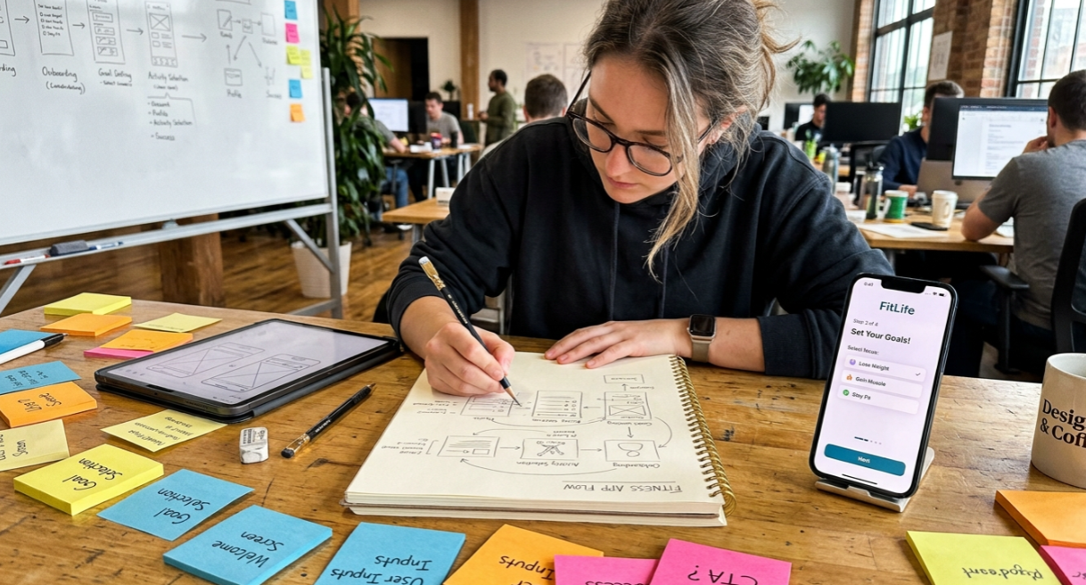
If you are planning a native iPhone app, onboarding should be mapped before a single screen is built. That is why tools like x1’s AI app studio exist: to help builders sequence screens, flows, and decisions before generating code.
Why App Onboarding Matters
Most app users decide quickly whether an app is worth keeping. The numbers are stark.
Adjust reports median mobile app retention of 26% on Day 1, 13% on Day 7, and just 7% on Day 30 across verticals. For iOS specifically, those numbers are slightly better (27%, 14%, 8%) but still mean roughly three out of four users are gone within 24 hours. Amplitude’s benchmark across 500 million mobile devices confirms the pattern: only 14% of users return on Day 7 after installation.
Onboarding cannot fix a weak product. But it can prevent a strong product from losing users who never got far enough to see what it does.
A well-designed onboarding flow affects five things:
Activation. Whether users complete the first action that predicts future use.
Trust. Whether users feel comfortable granting permissions and sharing data.
Personalization. Whether the first session feels relevant.
Monetization. Whether trial starts and subscription conversions happen at healthy rates.
Retention. Whether users come back tomorrow, next week, and next month.
The question is not “Did the user finish onboarding?” The question is “Did onboarding set up a reason to come back?”
App Onboarding vs Related Terms
These terms get confused constantly. Here is how they differ.
Term | What it means |
|---|---|
User onboarding | The broader concept of helping someone become successful with any product, whether that is a mobile app, SaaS platform, or internal tool. |
App onboarding | User onboarding inside a mobile app, with platform-specific concerns like permissions, small screens, app store rules, and native UI patterns. |
Activation | The outcome, not the flow. A user is activated when they complete the action that predicts future value (finishing a lesson, creating a habit, saving a note). |
Tutorial | Teaches how to use controls. Onboarding should create momentum, not just explain buttons. |
Launch screen | The brief visual shown while the app opens. Apple says onboarding happens after launching is complete. |
Empty state | What users see when content areas are blank. It is an onboarding opportunity, not onboarding itself. |
A tutorial explains controls. Onboarding creates momentum. They overlap sometimes, but they are not the same thing.
The Main Types of App Onboarding
Not every app needs the same first-run experience. The right pattern depends on how complex the app is, how much setup it requires, and how quickly users can reach value on their own.
Quickstart Onboarding
The app opens directly into the core experience with little or no upfront tutorial. Best for simple utilities, camera apps, calculators, note apps, or anything where the first action is obvious.
A photo editing app could open straight to image selection and ask for login only when the user wants to save or sync. The risk is that users miss advanced features, but contextual tips can fill that gap later.
Benefits-Oriented Onboarding
A short flow (usually two to four screens) that explains what the app does for the user. Not what features it has, but why they matter. “Build a daily writing habit in 5 minutes” works. “Feature-rich dashboard with advanced analytics” does not.
Sendbird describes this pattern as focusing on how the app improves the user’s life rather than listing features.
Self-Select Onboarding
The app asks users to choose goals, interests, level, language, or use case so the first session feels personalized. Spotify, for example, asks users to pick favorite artists so recommendations feel relevant immediately.
The risk is asking too many questions before delivering value. Only ask questions that change what the user sees in the first session.
Interactive Onboarding
The user learns by doing, usually inside the real product or a safe demo state. Apple recommends this approach because people grasp and retain information better when they perform the task they are learning rather than just reading instructions.
This works well for creative tools, gesture-heavy apps, and products where a blank screen feels intimidating.
Progressive Onboarding
Instead of front-loading everything, the app introduces guidance over time. Android’s design guidance recommends separating what must happen before use from what can happen while the user is already in the app. This is especially useful for complex, multi-feature products.
Permission-Led Onboarding
Onboarding that prepares users for permissions like notifications, location, camera, microphone, HealthKit, or tracking. The rule is simple: do not ask until the user understands the benefit.
UserOnboard’s guidance on permission priming recommends explaining both why the app is asking and how the user benefits, ideally at the moment the feature requiring that permission is first used.
Paywall Onboarding
A flow that leads to a subscription or in-app purchase offer, often after setup or personalization. Many consumer apps place paywalls after personalization because the user has invested effort and the offer feels tailored.
Indie app makers on forums often treat onboarding and paywall design as one combined conversion system. One Indie Hackers poster claimed a redesigned onboarding and paywall produced more revenue in a single week than the previous six months combined. That is anecdotal, but it signals how tightly founders connect these two flows. The glossary-level warning is that short-term trial starts and long-term retention can move in opposite directions.
Which App Onboarding Type Should You Use?
If your app... | Use this onboarding style |
|---|---|
Is simple | Quickstart |
Requires personalization | Self-select |
Teaches complex workflows | Interactive |
Requires verification | Progressive |
Relies on subscriptions | Paywall |
Uses cameras, GPS, or notifications | Permission-led |
Many apps combine multiple onboarding styles.
For example, a fitness app might use self-select onboarding, permission-led onboarding, and a paywall in the same flow.
What Does an App Onboarding Flow Look Like?
Most successful onboarding flows follow a predictable sequence.
Step | Goal | Example |
|---|---|---|
Welcome | Explain the value proposition | "Track every expense automatically." |
Personalization | Customize the experience | Select goals or interests |
First action | Deliver value | Create the first note |
Permissions | Unlock features | Enable notifications |
Account creation | Save progress | Create an account |
Retention | Encourage return visits | Daily reminder |
Not every app needs every step.
Simple utility apps might skip personalization entirely, while subscription apps might introduce a paywall before account creation.
The goal is always the same: reduce the time between installation and first value.
What Should an App Onboarding Flow Include?
Every onboarding screen should do one of four jobs:
Clarify value. Help the user understand why the app matters to them.
Complete required setup. Gather only what is necessary to make the first experience work.
Personalize the experience. Ask lightweight questions that immediately change what the user sees.
Unlock the first core action. Get the user to create, save, track, listen, learn, or do the thing they came for.
If a screen does none of these, it is friction. Cut it or move it somewhere else: App Store screenshots, a welcome email, an in-app tip, or the settings screen.
A practical minimum for most apps looks like this:
One value screen: “Here is what this app helps you do.”
One setup question (only if personalization changes the first session).
One first action: create, scan, track, save, or build something.
One permission prompt (only if needed for that action).
One save/continue step: signup only when the user has something worth saving.
For longer flows involving compliance, KYC, or multi-step setup, add progress indicators and time expectations. Coinbase, for instance, uses a progressive timeline that tells users how long each verification step takes.
If you are building an iPhone app, these decisions need to happen during planning, not after you have already generated screens. x1’s workflow handles this by letting you map screens and flows in a Plan stage before the Design and Build stages create the native app.
App Onboarding Examples by App Category
App type | Recommended onboarding strategy |
|---|---|
Fitness | Goal selection → workout → notifications |
Productivity | Create a task → save a project → account creation |
Finance | Identity verification → account linking → dashboard |
Ecommerce | Browse products → create a wishlist → checkout |
Social | Create a profile → follow users → publish content |
Different products require different onboarding strategies.
A meditation app can deliver value immediately through a guided session, while a banking app may require identity verification before any value can be delivered.
App Onboarding Best Practices
First Value Before First Ask
This is the single most important principle. Before asking for login, show why the account matters. Before asking for notifications, show what reminders help with. Before asking for a subscription, show what the paid plan unlocks. Before asking for a rating, give the user a successful moment.
Apple recommends delaying ratings or purchases until users have had a chance to become engaged with the app.
Every Extra Screen Is a Conversion Risk
Practitioners on Reddit report real drop-off numbers. In one developer thread, a practitioner shared that their employer’s app had about 18% drop-off on the single required onboarding screen, and adding three more screens sometimes pushed drop-off near 40%.
There is no universal ideal screen count. But every extra step should be treated as a measurable risk, not a free addition.
Ask Permissions at the Moment of Need
The “permission exchange” formula works: action, then reason, then benefit, then system prompt.
“Turn on reminders so we can notify you before your daily lesson.”
“Allow camera access to scan your first receipt.”
“Allow location so we can show homes near you.”
OneSignal recommends capturing push opt-in through an in-app message after signup, tutorial, or the first “aha” moment so the prompt arrives with context. Their data shows an iOS initial push opt-in rate of 43.9%, which means timing and copy directly affect whether more than half your users never receive a notification.
Make Optional Education Skippable
Required setup does not have to be skippable. But if a screen only explains a feature the user has not tried yet, let them skip it.
Track First Value, Not Just Completion
A flow can have a high completion rate and still fail if users do not complete the first core action or return the next day. The best success metric is usually: new users who complete onboarding and then complete the app’s first core action within the same session or first 24 hours.
How to A/B Test an App Onboarding Flow
Test one variable at a time.
Common experiments include:
Removing a welcome screen
Delaying account creation
Moving the paywall
Reducing personalization questions
Rewriting permission requests
Adding a skip button
Track:
Completion rates
First-action completion
Trial starts
Day 1 retention
Day 7 retention
The winning variation is not always the one with the highest completion rate. Long-term retention should be the primary success metric.
Use Interaction Over Explanation
A user is more likely to understand a feature when they are using it than when reading about it before they care. Both Apple and Google favor contextual, interactive education over heavy upfront instruction.
iOS-Specific Onboarding Considerations
Building for iOS means onboarding decisions can directly affect App Store review outcomes, not just user experience.
Login Rules
Apple’s App Review Guidelines are clear: if an app does not include significant account-based features, it should let people use the app without login. And if account creation exists, the app must also offer account deletion within the app.
Do not force account creation just because it is convenient for the backend. Force login only when the account is central to the product: syncing, identity, purchases, collaboration, or user-generated content.
Subscription and Paywall Compliance
Apple requires that subscription apps clearly describe what users get for the price before asking them to subscribe. Subscriptions must provide ongoing value, last at least seven days, and work across the user’s devices. Apps that trick users into purchasing under false pretenses will be removed.
A paywall can be part of app onboarding, but it must be transparent. The user should understand what they get, what it costs, when a trial converts, and how the subscription renews.
App Store Screenshots as Pre-Install Education
Apple’s product pages can feature up to 10 screenshots. This matters for onboarding because some feature education belongs on the App Store listing, not inside the first-run flow. If you can explain a capability in a screenshot that 100% of potential users see, you reduce the burden on onboarding screens that only activated users reach. For guidance on creating effective screenshots, see this tools comparison.
Native Feel
iOS users expect standard navigation patterns, system fonts, and native controls. An onboarding flow that looks like a web page inside an app erodes trust immediately. This is one reason building with native Swift and SwiftUI matters.
How App Onboarding Is Built
For a simple static intro, iOS developers commonly use SwiftUI’s TabView with .tabViewStyle(.page) and persist completion using @AppStorage or UserDefaults. A 2026 SwiftUI tutorial describes this as the default starting pattern for basic onboarding flows.
But simple carousels break down fast. Once the flow includes required inputs, permission prompts, paywalls, branching, or dynamic step ordering, developers need a stateful approach: enum-based steps, a coordinator or parent manager, ordered arrays of step models, callbacks for completion, saved progress, and analytics events.
Practitioners on Reddit recommend enum and data-driven flow structures with a parent source of truth for flexible ordering. One developer in a Swift thread pointed out that TabView makes forward-only progression, validation, and skip logic unnecessarily hard once the flow gets complex.
A carousel is a UI component. Onboarding is a stateful product flow. If the flow includes required inputs, permissions, subscriptions, or branching, model it like a state machine, not a slideshow.
A LinkedIn practitioner described a mature mobile onboarding system with over 350 steps and 500 transitions, eventually moving from app-embedded configuration to backend-driven JSON because mobile release cycles slowed experiments and fixes. Simple apps can hard-code onboarding. Mature apps often need it as configurable product infrastructure.
For non-technical founders who want to skip the SwiftUI complexity entirely, AI app builders can handle the implementation. With x1, you shape the flow visually in the Design stage and the Build stage generates native Swift code, so the onboarding architecture is handled without writing enums or coordinators by hand.
Try x1 free to see how screen mapping works before committing to a build.
How to Measure App Onboarding

Key Metrics
Metric | What it tells you |
|---|---|
Onboarding start rate | Whether the flow is shown correctly to new users. |
Step completion rate | Which specific screen causes the biggest drop-off. |
Skip rate | Whether users perceive the flow as useful or annoying. |
Time to complete | Whether friction or confusion is hiding behind “completion.” |
Permission opt-in rate | Whether timing and rationale are working. |
First core action rate | The best activation proxy. |
Trial start rate | Monetization health for subscription apps. |
D1/D7/D30 retention | Whether onboarding leads to durable value, not just a completed flow. |
Apple’s App Store Connect retention data can compare cohorts by app version, device, region, and source, helping teams evaluate whether an onboarding update actually improved engagement. But Apple warns this data only includes users who opted into sharing diagnostics, so it is directional rather than complete.
Combine Quantitative and Qualitative Data
A Reddit UX practitioner shared that retention curves consumed months of work but did not explain the cause of churn. Watching first-session recordings of churned versus retained users made the problem obvious: users reached the home screen and could not tell which button matched their intent.
Analytics show where the leak is. Recordings and usability tests show why. Use both.
Recommended Event Names
Track these events at minimum: onboarding_started, onboarding_step_viewed, onboarding_step_completed, onboarding_step_skipped, onboarding_completed, permission_prompt_shown, permission_granted, permission_denied, paywall_viewed, trial_started, first_core_action_completed.
App Onboarding Benchmarks (2026)
Metric | Healthy benchmark |
|---|---|
Onboarding completion | 60–80% |
Push notification opt-in | 40–60% |
Time to complete | Under 2 minutes |
First core action | 50%+ |
Day 1 retention | 25–30% |
Day 7 retention | 10–15% |
Day 30 retention | 5–10% |
Benchmarks vary by industry.
A cryptocurrency exchange will have lower completion rates than a simple note-taking app because compliance requirements introduce additional friction.
Examples of Good App Onboarding
Duolingo puts users into a quick language lesson during onboarding, delivering value before asking for signup. Streaks and gamification create an immediate reason to return. This is interactive onboarding at its best: learn by doing, not by reading.
Calm starts with a breathing exercise and asks about mindfulness goals before introducing optional signup. The onboarding itself feels like using the product.
Spotify uses self-select onboarding, asking users to pick favorite artists so the first playlist feels personal rather than generic.
Coinbase faces a different challenge: KYC-style verification that takes real time. Their approach uses a progressive timeline with estimated durations for each step, setting expectations instead of surprising users with delays.
Strava combines multiple patterns: sign-in options, notification opt-in, required permissions for GPS, and preferred sport selection. Each step has a clear reason tied to the core running and cycling experience.
App Onboarding Checklist
Before launching your onboarding flow, verify that you can answer "yes" to every question.
Does the first screen explain the app's value?
Can users reach the first meaningful action quickly?
Is every question necessary?
Are optional tutorials skippable?
Are permissions requested only when needed?
Is the paywall transparent?
Can users skip account creation?
Are analytics events configured?
Is the onboarding flow A/B tested?
Have you tested the experience on real devices?
If the answer is "no" to any of these questions, revise the flow before releasing the app.
Common Mistakes
Opening with a feature carousel. If five slides explain features before the user tries anything, most of that information will be forgotten. Move feature education into App Store screenshots and metadata, contextual tips, or empty states.
Forcing signup before value. Unless the app genuinely cannot function without an account, let users experience something meaningful first.
Asking for multiple permissions at launch. Trust has not been built yet. Users deny reflexively.
Optimizing for completion instead of activation. A user who swipes through four slides and then closes the app is not a success. A user who skips onboarding but completes a core action is.
Building onboarding as hard-coded screens. If you cannot reorder, A/B test, or remove a step without a new app release, iteration will be painfully slow.
Ignoring App Review implications. Onboarding decisions about login, permissions, and paywalls can trigger rejection. Understanding App Store review requirements before building saves weeks of back-and-forth.
Design Your Onboarding Before You Build
The difference between a good app and a forgettable one often appears in the first five screens. Signup flow, permission timing, paywall placement, personalization questions, and the path to first value all need to be sequenced before code is written.
That is why structured planning matters. x1 walks builders through this process: the Plan stage maps screens, features, and flows. The Design stage lets you shape layouts, copy, buttons, and screen order. The Build stage generates the native iPhone app. The Launch stage handles screenshots, App Store listing, and submission.
Onboarding is not an afterthought you bolt on at the end. It is the first real product decision.
See x1 pricing and plans to start building your app’s first-run experience.
Frequently Asked Questions
What is app onboarding?
App onboarding is the first-run flow that helps new users understand an app, complete required setup, and reach first value. It can include welcome screens, account creation, preference questions, permission prompts, paywalls, tutorials, or contextual tips.
How many onboarding screens should an app have?
As few as possible, but enough to help the user succeed. Simple apps may need none. Complex apps may need several steps for setup, personalization, or compliance. Practitioner data from Reddit shows that screen count directly affects drop-off, so the best answer is to test the shortest flow that still produces activation.
Should app onboarding be skippable?
Optional education should usually be skippable. Required setup (like account verification or essential permissions) does not have to be, but it should be clearly justified. Apple recommends making onboarding optional when a separate tutorial makes sense.
When should an app ask for permissions?
Ask when the permission is needed or when the user understands the benefit. Apple recommends requesting sensitive access at the time the app needs it. The best approach is to explain why the app is asking and how the user benefits, right before the system prompt appears.
Is a paywall part of onboarding?
It can be, especially for subscription apps. But it should be clear and honest. Apple requires that subscription apps clearly describe what users get for the price before asking them to subscribe. Apps that trick users into purchasing will be removed from the App Store.
What is the difference between onboarding and activation?
Onboarding is the experience. Activation is the result. A user is activated when they complete the first meaningful action that predicts future use, like finishing a lesson, creating a habit, or saving a note.
How do you measure app onboarding success?
Track step completion rates, permission opt-in rates, first core action completion, and D1/D7/D30 retention by cohort. Do not optimize only for onboarding completion. A high completion rate means nothing if users never return.
Can AI tools help build app onboarding flows?
Yes. AI app builders can help plan, design, and generate onboarding screens as part of a full native app. The key is choosing a tool that supports structured flow planning, not just one-shot screen generation, so the onboarding sequence is coherent from start to finish.
How long should app onboarding take?
Most onboarding flows should take less than two minutes. Simple apps may require less than 30 seconds, while finance and healthcare apps often require additional verification steps.
What is the average onboarding completion rate for mobile apps?
Many product teams target completion rates between 60% and 80%, although the ideal benchmark depends on the complexity of the app.
Can users skip app onboarding?
Yes. Optional educational content should usually be skippable. Required compliance, security, or account verification steps may not be.
Is onboarding part of UX design?
Yes. Onboarding is one of the most important components of user experience because it shapes a user's first impression of the product.